
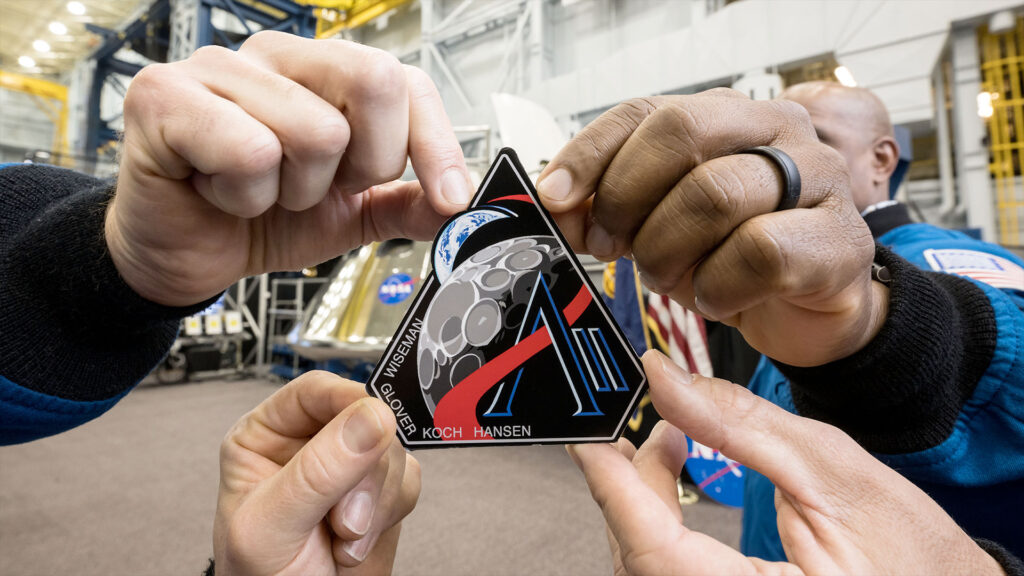
When most people look at the Artemis II mission logo, they see a mission patch.
We see something else.
We see a missed branding opportunity.
🌕 A Design That Includes Everything… and Says Less

At first glance, the logo feels complete:
- A bold “A”
- Earth and Moon
- A trajectory line
- Space-inspired colors
It tells a story — but here’s the problem:
👉 It tells a general story, not a specific one.
This could represent:
- Any Artemis mission
- Any space journey
- Any exploration narrative
And that’s where it loses power.
🧠 Storytelling vs. Positioning
There’s a critical difference in branding:
- Storytelling → “What is happening?”
- Positioning → “Why is this different?”
The Artemis II logo successfully communicates:
- Exploration
- Movement
- Connection between Earth and Moon
But it does not clearly communicate:
- Why this mission matters
- What makes Artemis II unique
- What differentiates it from Artemis I or future missions
👉 It informs — but it doesn’t position.
🎯 Not Simple — Just Familiar
At first, the design might feel minimal.
But it’s not truly simple.
It includes multiple familiar elements:
- Orbit lines
- Planet visuals
- Gradient space backgrounds
- Mission typography
These are expected visual cues, not distinctive ones.
👉 The result:
A design that feels correct…
but not memorable.
⚠️ When Design Becomes Generic
This is a common issue — even at the highest level.
When a design:
- Uses all the “right” elements
- Follows expected visual language
It risks becoming:
👉 Interchangeable
And in branding, interchangeable = invisible.
📦 What Brands Can Learn from This
This is where the real lesson is.
Many brands think:
“If we show everything, we communicate more.”
But in reality:
👉 The more you include, the less you differentiate.
Strong branding does not aim to:
- Explain everything
- Show everything
It aims to:
- Highlight what only you can own
🚀 The Missing Layer: Distinction
Imagine if the logo clearly reflected:
- “First crewed return after decades”
- “Human presence, not just mission path”
- “A specific emotional or historical milestone”
That would shift it from:
Storytelling
to
Meaningful differentiation
⚡ Final Thought
The Artemis II logo is not плох design.
It’s complete.
It’s functional.
It tells a story.
But great branding requires more than storytelling.
It requires clarity of difference.
Because in a world full of noise,
being correct is not enough.
👉 You have to be unmistakable.
👉 RACOOB Perspective
At RACOOB, we believe:
Design is not about adding more elements.
It’s about identifying what truly matters — and making it impossible to ignore.
Because strong brands don’t just tell stories.
They claim space.